Futura: The Key to Wes Anderson and Stanley Kubrick
How a Bauhaus-inspired font had an impact on motion picture history.
Jon Ronson has occupied rather a lot of my reading time over the last fifteen years or so. He’s a fake northerner, quite possibly a fake keyboard player, and (other people might say) he is a fake journalist. The word fake has such negative connotations that I feel the need to explain myself. I think Jon Ronson just follows the whims of his childlike and deeply felt curiosity, and later on tries to justify himself in various different ways.
During the Frank Sidebottom Big Band years Ronson pretended to be a keyboardist. For a while he pretended to be a documentary film-maker, which at least covered the expenses on some of his wilder road trips, not least journeys to the Bilderberg Conference, something to do with Scientology and the recreation of a James Bond drive across Europe to Geneva, from the book Goldfinger, during which he ate the same meals as Bond and piloted an Aston Martin at an average speed of 30mph.
But I have seen through it all. I believe that Jon Ronson has now reached his final form as a podcaster and one-man showman. Jon, it should be obvious, is a card-carrying genius. Who else could have hoodwinked George Clooney into making a movie about men staring at goats? Who else could have inspired me to spend several hours researching something as mundane and fascinating as a typeface?
This episode, as my psychiatrist would no doubt label it, began with Stanley Kubrick’s boxes. Kubrick was the last word in hoardy obsession. He was so obsessive and precise that he designed some custom archive boxes in which to store his more obsessive predilections. Even the company that received his order labelled him ‘fussy’ in writing and no doubt said far worse behind closed doors. As Kubrick himself was said to reply, is it really fussy to want lids that slide smoothly from their boxes or just totally rational? Why would any self-respecting box-maker be satisfied with sticky lids? Indeed.
After Kubrick’s untimely demise, Jon Ronson was invited to Kubrick HQ in Hertfordshire for reasons which were never really made clear in one of the articles in his collection, called Lost at Sea: The Jon Ronson Mysteries. One way or another Ronson obtained permission to snoop around in the hundreds of boxes Kubrick had acquired to house his ‘research’ but really they document the deep thinking of an obsessively creative mind. Everything from genuine movie research (including every doorway in a very long road in London, which took one year, a ladder and perhaps 30,000 photos to complete) to the administrative detritus of a long life lived in public, such as fan letters, organised (of course) by the hometown of the sender.
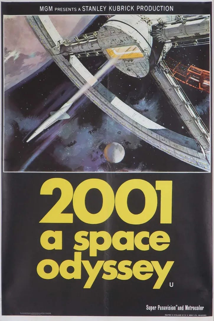
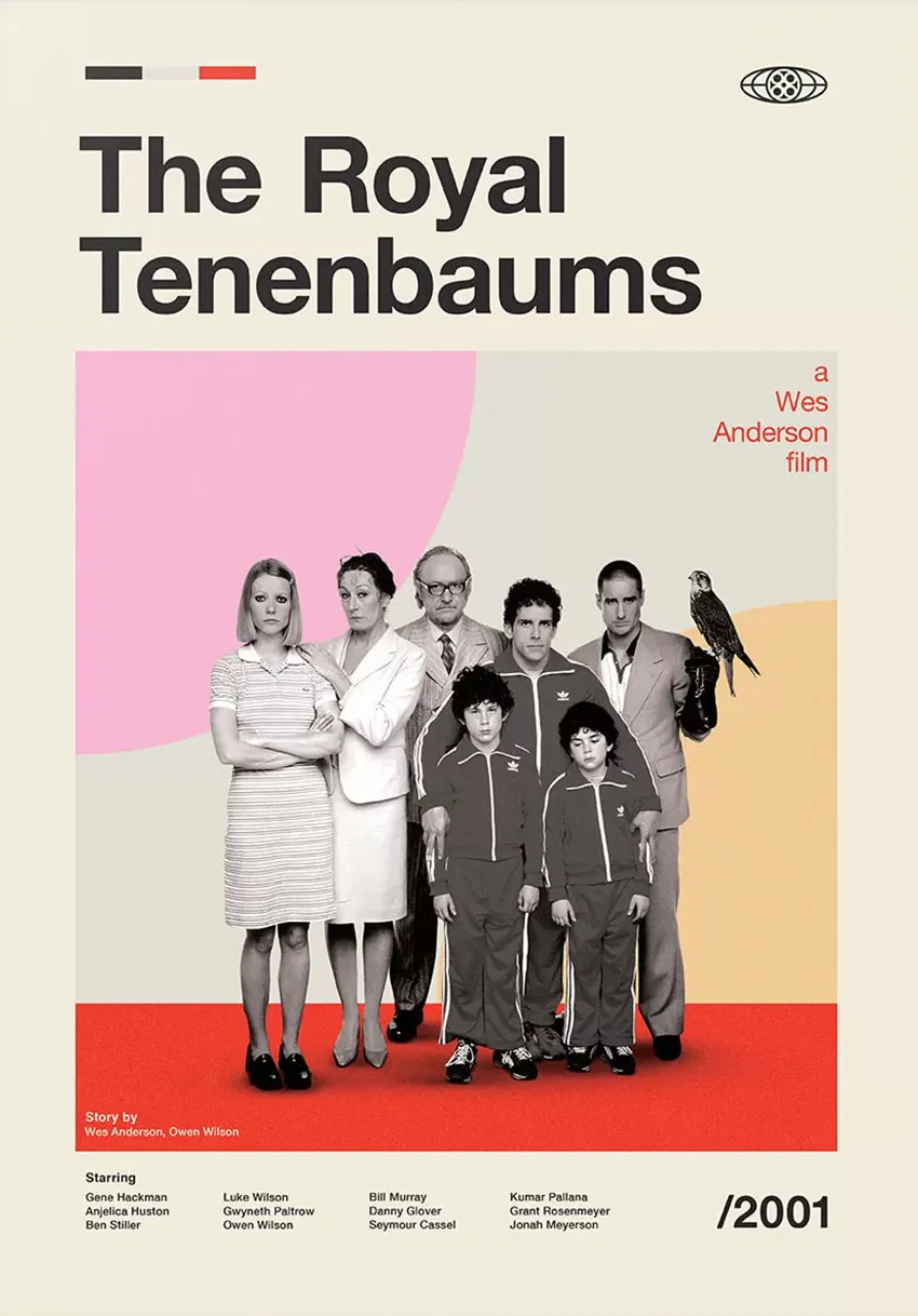
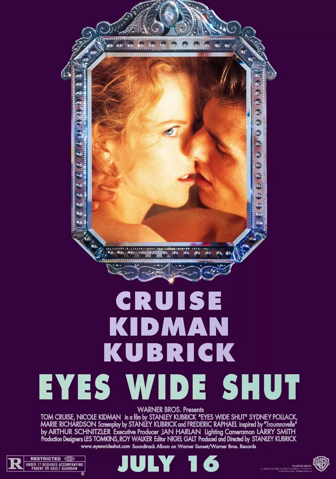
For me, the most arresting information contained in Ronson’s article was the revelation that Kubrick not only had a favourite font, but that he used it repeatedly over the years and, even more surprisingly, this was also the same font favoured by Wes Anderson, a man also given to meticulous pedantry in his films. Let’s lift the lid on Futura.
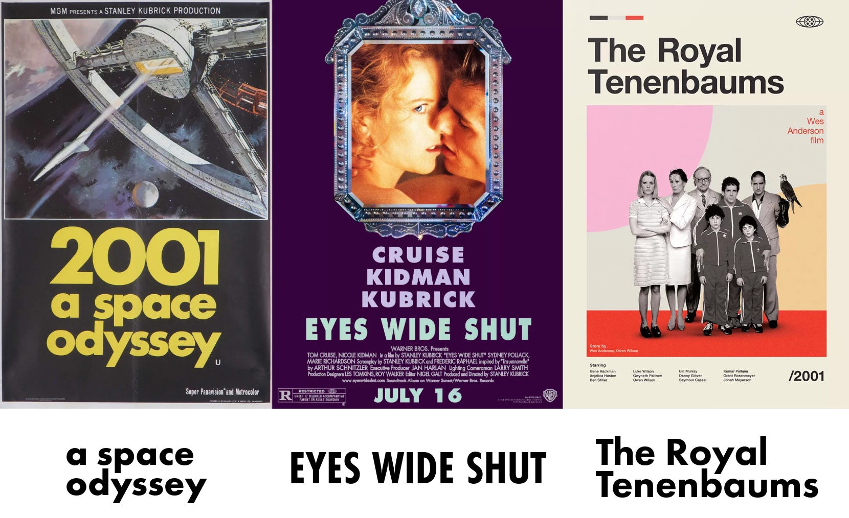
I have to confess I was not totally convinced by this theory that the Futura font that Kubrick loved was even the same font as Wes Anderson’s. The text is so different between Space Odyssey and Eyes Wide Shut, and different again in The Royal Tenenbaums poster. But the experiment above shows just how much variation is possible by mixing case and colour. It even turned out that Eyes Wide Shut is a version of Futura called condensed which means narrow. Once you capitalise and condense Futura, you can see that it really is the same font as for Space Odyssey.
Although Kubrick was partial to stationery it does not feature in his films, apart from some bog standard typewriter paper in The Shining. The same cannot be said of Wes Anderson. It was Mrs Tennessee Vibes who first noticed that he had contracted the famous London stationer’s Smythson to provide bespoke stationery for a movie. Could that have been The Royal Tenenbaums? Certainly it also featured in The Life Aquatic. The strangest thing is that I can find no confirmation online that he actually did use the Smythson company. Was I imagining those blue cardboard boxes? No.
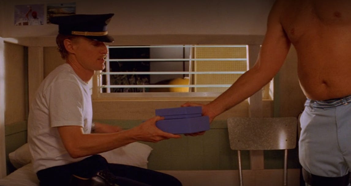
For all I know there isn’t an example of a Wes Anderson film without personalised writing paper or correspondence cards. It is quite a moment when their trademark blue boxes arrive at our house. As for a fresh pair of Adidas trainers (also The Life Aquatic), it brings deep meaning to the word unboxing. And, for the record, the lids are wont to stick.
I find it hard to justify using a fountain pen — my ink preference would be bright green or brown, the latter colour (it turns out) I share with the great Kubrick himself — on real paper these days to write to anyone. Who would be mad enough to share their actual address with me? And even if they did, could I afford the stamp?
Anyway, you see how easily I am distracted towards stationery. More on Futura. It has been around for a century, give or take. The original design by Paul Renner was released in 1927. He worked for the legendary type foundry Bauersche Gießerei, which had been on the go since 1837. This is a whole other world in which the fonts we all use every day can be traced back a hundred years or more and survive in the present, long after their founders went bust. Their rival Ludwig & Mayer had a rival typeface called Erbar. Both are virtually indistinguishable, at least to amateurs such as me, and both are based around the circle as their main idea. Easy to spot when you know, and not all the difficult to guess if you do not.
These days when someone thinks of a font or typeface — the words are interchangeable now — they tend to think of a digital download. For my whole life, since Microsoft launched their TrueType font system, fonts have been something on a computer screen. This was not the case in 1927. It might seem obvious, but fonts then were real objects. They were lumps of metal carefully crafted to work well with real wet ink, not to gum up or block every few minutes. There was more to a great font design than mere appearance. They were practical expressions of engineering combined with art and design.
If you want to get pedantic, and I very much do, the typeface is the generic name of the overall appearance of the letters and numbers: the core design elements. The font, on the other hand, is more specific than that. It refers to a specific letter size, ‘weight’ (or boldness) and whether it is italic or not, or underlined. Although underlining is open to debate. And what of subscript and superscript?
What is clearest in Wes Anderson’s movie output is the Bauhaus influence, the art deco, the neatness and clarity of his sets. Reviews of this summer’s The Phoenician Scheme, which I loved, were a little unkind in places. Some even suggested that he had grown more bothered about the scenery than about his characters, never mind there being any discernible plot. Who cares? Certainly at the cinema there was so much to look at that I didn’t really notice the comparatively absent plot. In my book, Mia Threapleton stole the show (playing a sort of nun-goth) and demonstrated that she has an enormous future.
I have no idea if this font investigation makes me as creative, as obsessive or indeed as odd as either Kubrick or Anderson. But I do love a typeface, and I do know that it impacts readers in prose, and in poetry even more so. As does whitespace and punctuation. And I do love, in a very odd and deep way, my extensive stationery cupboard, which almost fills a whole wardrobe and which I continue to extend even when I do not need it. I hope you find this article as interesting to read as I found to write.
You might argue that this piece has nothing to do with music, and you would be wrong. I have spent the summer interviewing the Memphian singer-songwriter Cyrena Wages for our podcast, and I was inspired to revisit the works of Wes Anderson when preparing to discuss her brilliant song from last year, Wes Anderson Love Story. See here for the relevant episode. So there. And anyway, Tennessee Vibes is as much a holistic way of life as a music newsletter anyway.
Cyrena Wages @ Home: Episode 4

This is our fourth chat with Cyrena Wages in which we talked about some very deep, dark topics, and we fail miserably to stay on the boppin’ light side of life. This is the Larkin poem we were talking about: This Be The Verse.